


Research has shown that people make 90% of snap decision purchases based on the perception of a brand’s colors. Thus web design color combinations should be selected in a methodical manner, to not only bring harmony to the design, but to evoke the emotions and actions desired by those who visit.
RGB vs. CYMK
Colors for web vs. print
The first step to creating a UI guideline is converting the VI color palette which is often represented in CMYK (cyan, magenta, yellow, black) for print use, into RGB (red, green, blue) for digital use. This is because digital screens emit light and paper absorbs light. It is an important step to ensure that the colors of the brand’s print and digital materials look the same.
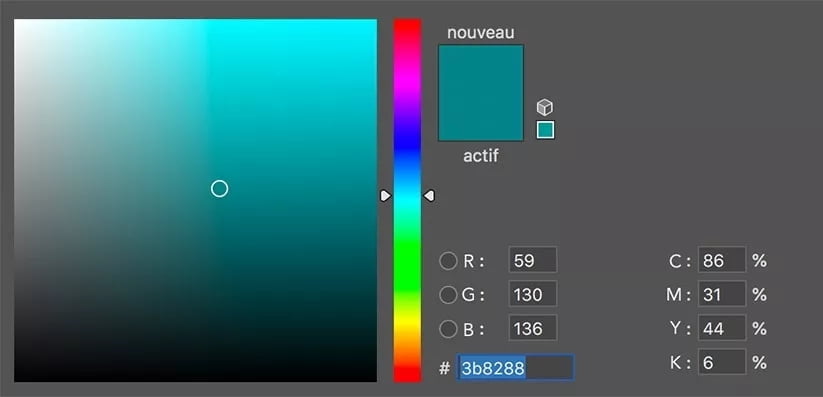
Furthermore, for the purpose of HTML or CSS code in web development, we use a hexadecimal code to represent the RGB. In hexadecimal code, the first two characters define the intensity of the red color, the next two define the intensity of the green, and the last two define the intensity of the blue in the RGB system.


With modern browsers supporting the full spectrum of 24-bit color, there are more than 16 million different color possibilities. Since most modern web designs employ only around 4 of these colors, the importance of understanding how color schemes are created is crucial to professional web design.
Choosing the UI color palette
The colors of the website should be chosen carefully from the brand’s VI. These ~4 colors are then used to create the structure and navigational cues of the website. The foundation of the UI (user interface) color palette is the main brand color and the most prominent color of the website. Using this main color as the base; headings, backgrounds, buttons, key images and other elements are designated a color through the use of color theory schemes and with an understanding of the audience and feelings desired.

Color schemes
In color theory, a color scheme is the choice of colors used in design based on a colors’ location on the color wheel. Color schemes are not a finite formula for choosing the web colors, but rather serve as a reference point. The designer takes into consideration context, competition research, and the psychology of colors when making the final selection.
Complementary colors
Complementary colors are directly opposite of each other on the color wheel. Complementary colors are contrasting and stand out against each other.
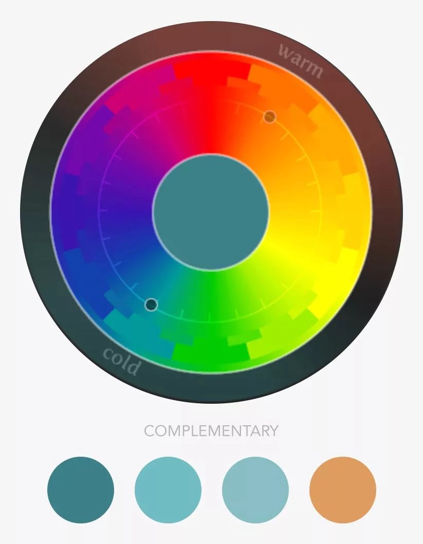
Web design application: When used with the main color, they are very cohesive, and can be used as subtle cues of change for the user, for example, a submenu, footer or mouseover effect.
Monochrome
Composed of one color consisting of various tints, shades and saturations. Black, white and grayscale are also included in monochrome.

Web design application: When used with the main color, they are very cohesive, and can be used as subtle cues of change for the user, for example, a submenu, footer or mouseover effect.
Analog colors
Colors that lie on either side of a given color. This color scheme is often found in nature, and these colors create a harmonious feeling.
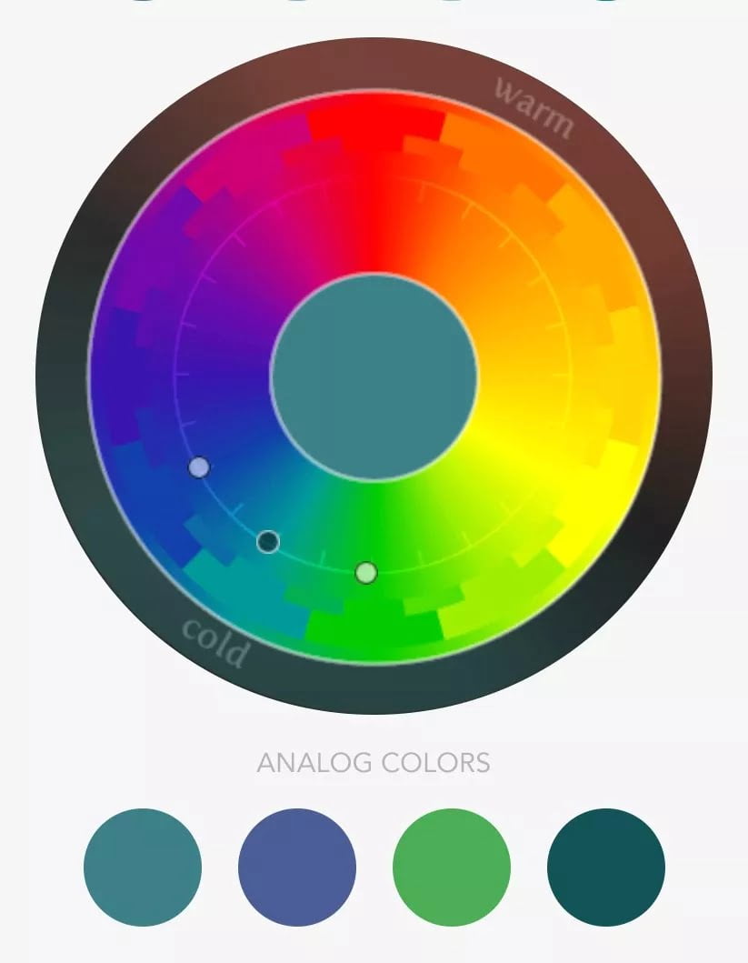
Web design application: Analog colors are often used for the secondary, supporting colors of the website, and are chosen based on the main color. Secondary colors are used to break up the page and create unique sections.
Triad colors
This scheme consists of three hues that are equidistant on the color wheel. These colors create a more colorful, dramatic feeling than analog.
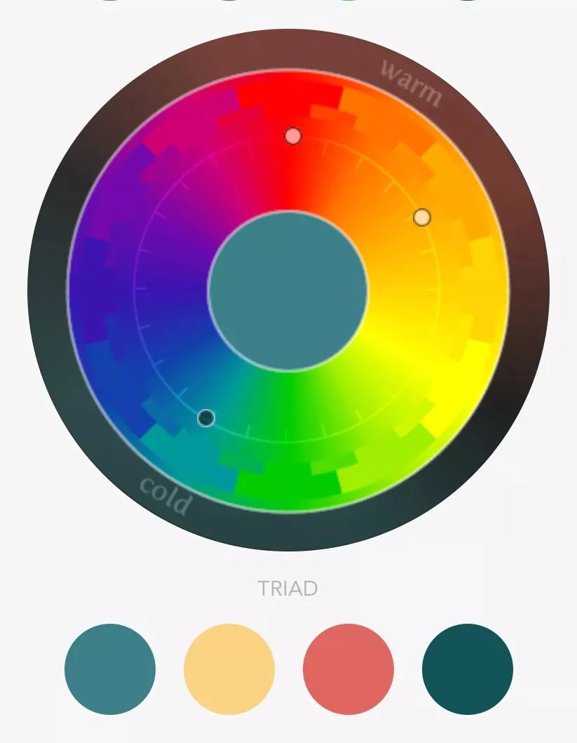
Web design application: A triad color scheme is an alternative to analog when choosing the supporting colors of the website. They can also be applied to functional colors which are additional colors used sparingly throughout the site, for example, news articles or products that require tags or categorization labels.