Follow the Flow journey with Curio Education and how we helped their logo stand out.
Curio Education
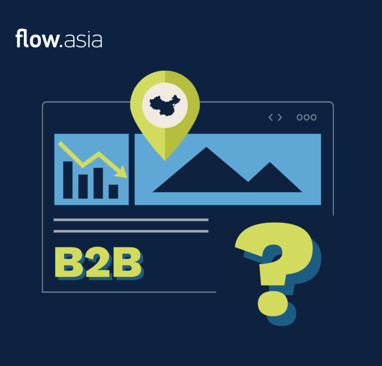
Curio works with Chinese families interested in an overseas education. Through cutting edge mentorship and personalized counseling Curio helps students discover their passions, gain successful university progression and foster effective study habits to prepare them for an independent life abroad.
Does Your Logo Work?
When design a logo the three most important elements are: Color, Design and Font.
![]()
Curio Education wanted its customers to feel that they provide a destination/goal to their students by using this pin design. Purple was a combination of red (passion) and blue (education). The C inside the pin was short for CURIO.
The design had the following issues:
Color
- The purple color was very dull
Design
- Customers did not understand what CURIO did just by looking at the logo especially when the logo was displayed by itself without the company name
- CURIO’s name had a nice meaning but was not easy for people to understand or remember *CURIO=something unique, and of value*
Font
- The fonts did not pair well together
Does Your Logo Match Your Values?
To help Flow better understand the core values of CURIO we asked what are the 3 defining characteristics of CURIO.
CURIO’s values
- Caring
- Professional
- Responsible
We then asked what are other important considerations for the design.
CURIO’s requirements
- Name must remain unchanged
- Purple is an important color for CURIO
- Would like to keep the pin element in
- the design if possible
Flow Turns Ideas into Action
Using the above principles, CURIO’s values and requirements our designers reinvisioned CURIOs logo.
![]()
We choose a more bolder purple that still represents passion and education and really makes the logo stand out. This color also added more interesting color options for additional branding colors.
![]()
![]()
A special pin design element was created that could be used on its own or with the rest of the CURIO letters. The student with the graduation cap really helps promote that CURIO is in the education industry.
![]()
![]()
We decided to incorporate CURIO’s Chinese name into the logo which helped Chinese customers remember the name. A unique English font was created that could pair with the element that creates the “C” in CURIO.
![]()
![]()
![]()
Here are some design decks we explored that used CURIO’s new logo and branding colors to show how versatile the new design was.
![]()
![]()
![]()
![]()
This new logo is easier to understand and really stands out. With one look clients could easily understand that CURIO was an education company. CURIO loved their new look and was very excited to see how Flow could further enhance their designs in the future.
“Flow helped us refresh our logo and we are thrilled with the result. Their team was very thorough exploring our company’s values and they always asked for our input. The resulting logo surpassed our expectations.”
– Curio Education
![]()
At Flow we work with you to make sure our design matches the vision of your company. Our expert designers work with you to explore all the possibilities while adding important elements that we know will help your logo impress.