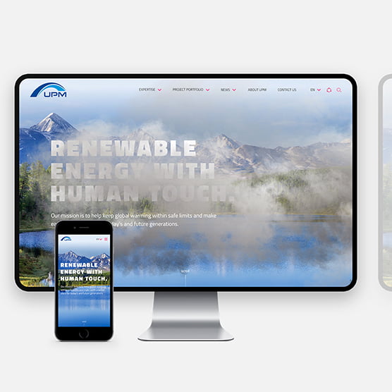

UPM wanted a place to digitally bring to life their work in climate protection and sustainable development. We created an interactive website that illuminates UPM’s human touch throughout their global reach.
“UPM works to keep global warming within safe limits and make Earth a better place for today’s and future generations.”
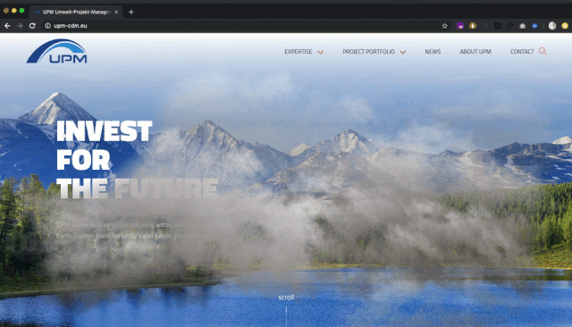
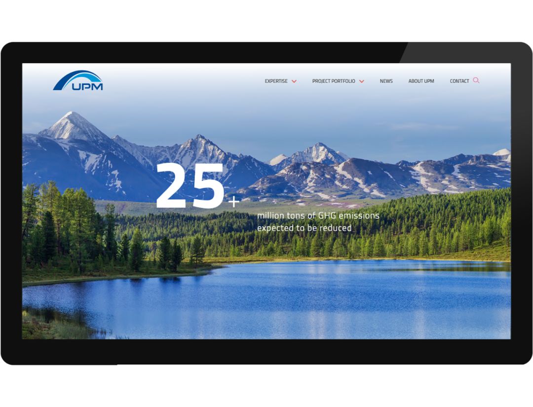
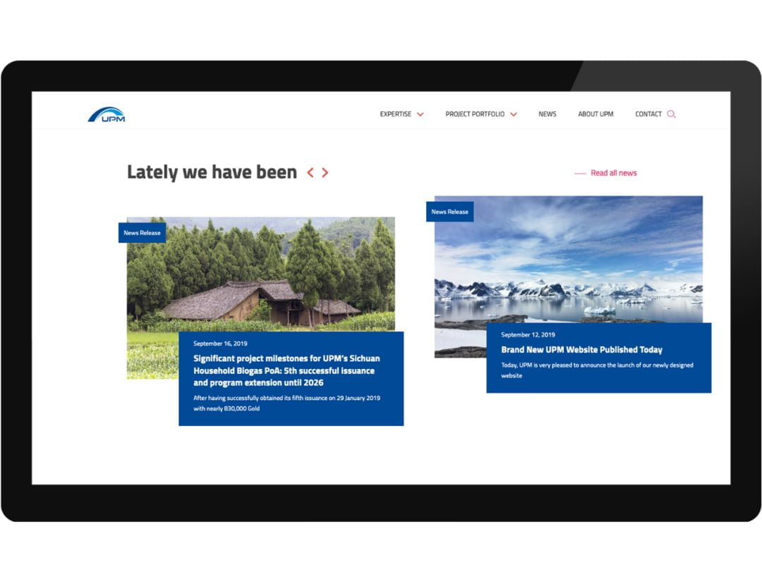
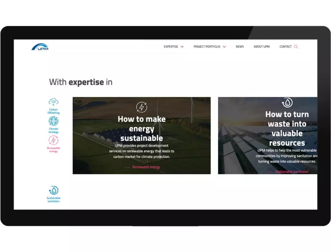
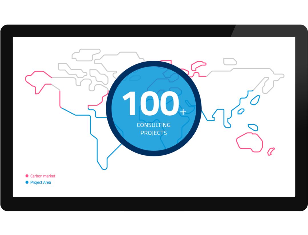
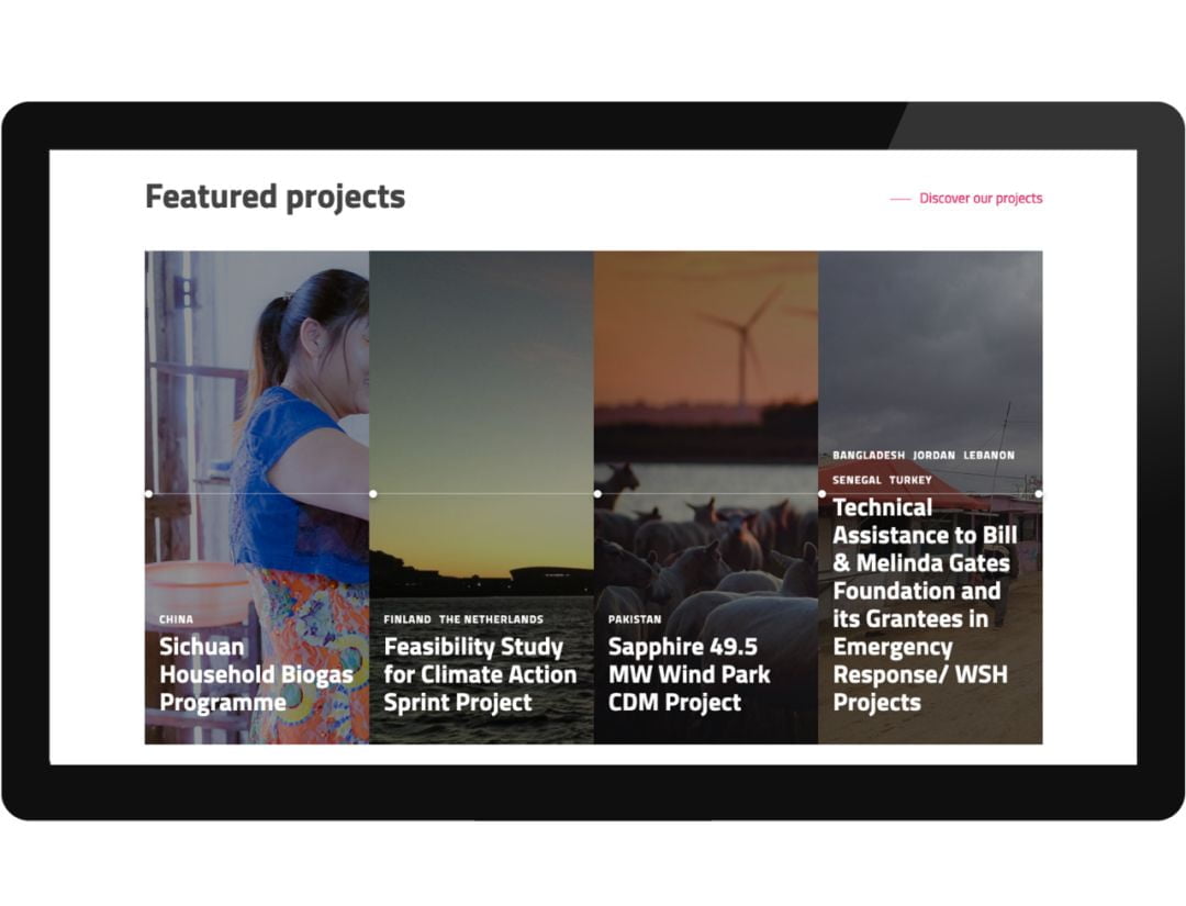
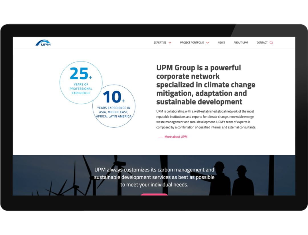
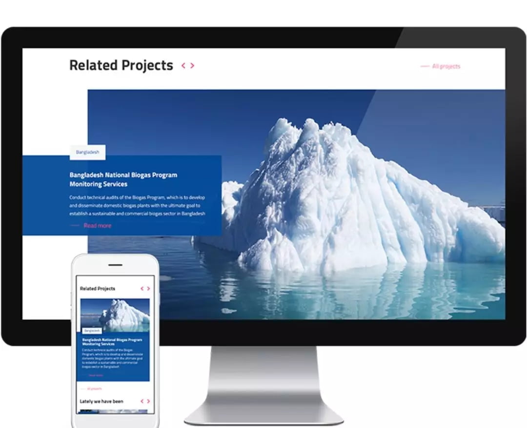
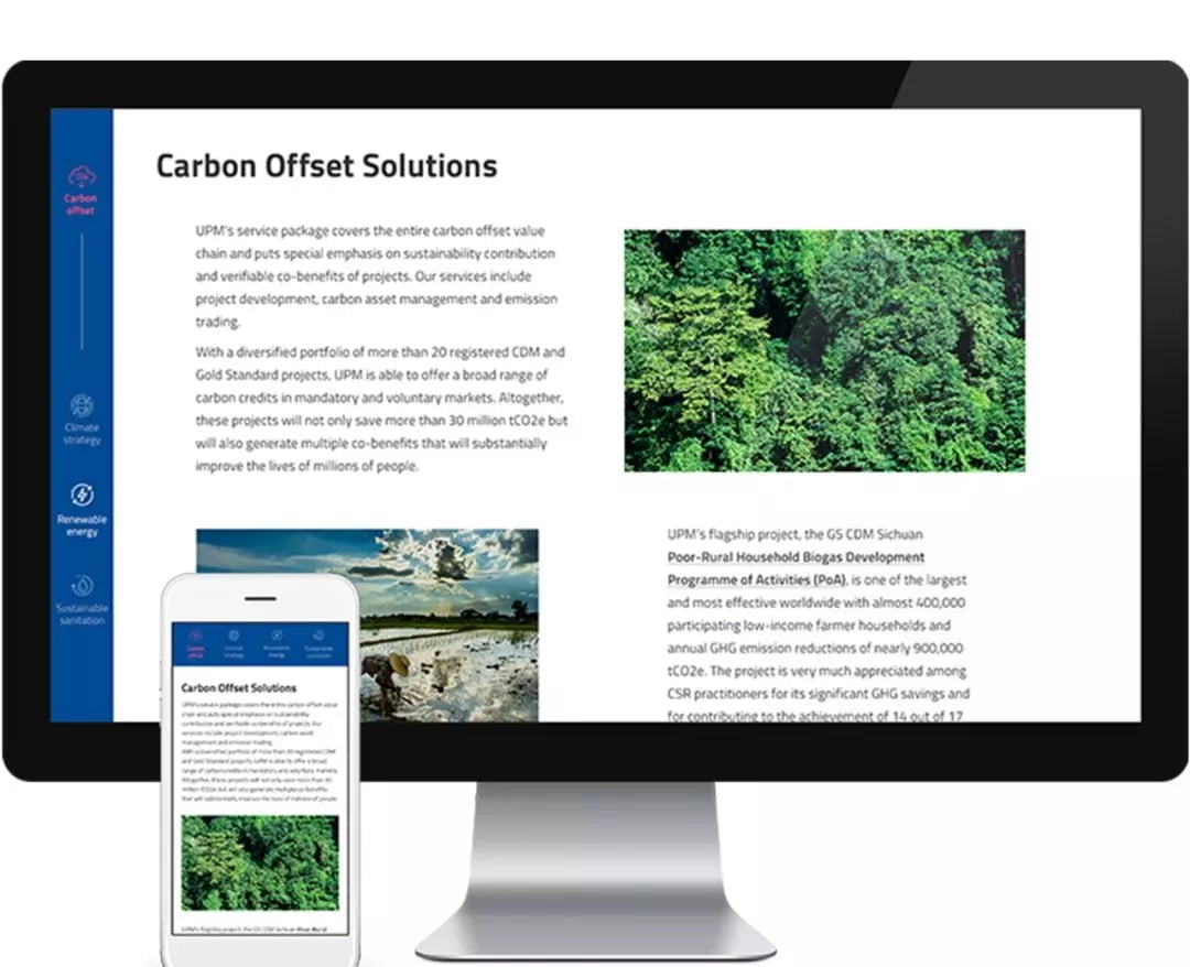
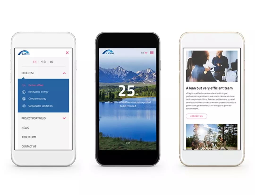
The homepage was conceptualized to tell the story of UPM’s work and proactive vision. Immediately upon landing, the website visitors are faced with beautiful mountains shrouded in smog and the choice to wipe it away (desktop only). Each subsequent section presents a different component of the story in a conversational, active hierarchy and tone. We wanted those who came to the site with a specific purpose to be able to easily navigate to that, but also to discover unexpected information along their journey. A big focus was placed on presenting clear titles and real life images so that the people, places and work can speak for themselves.
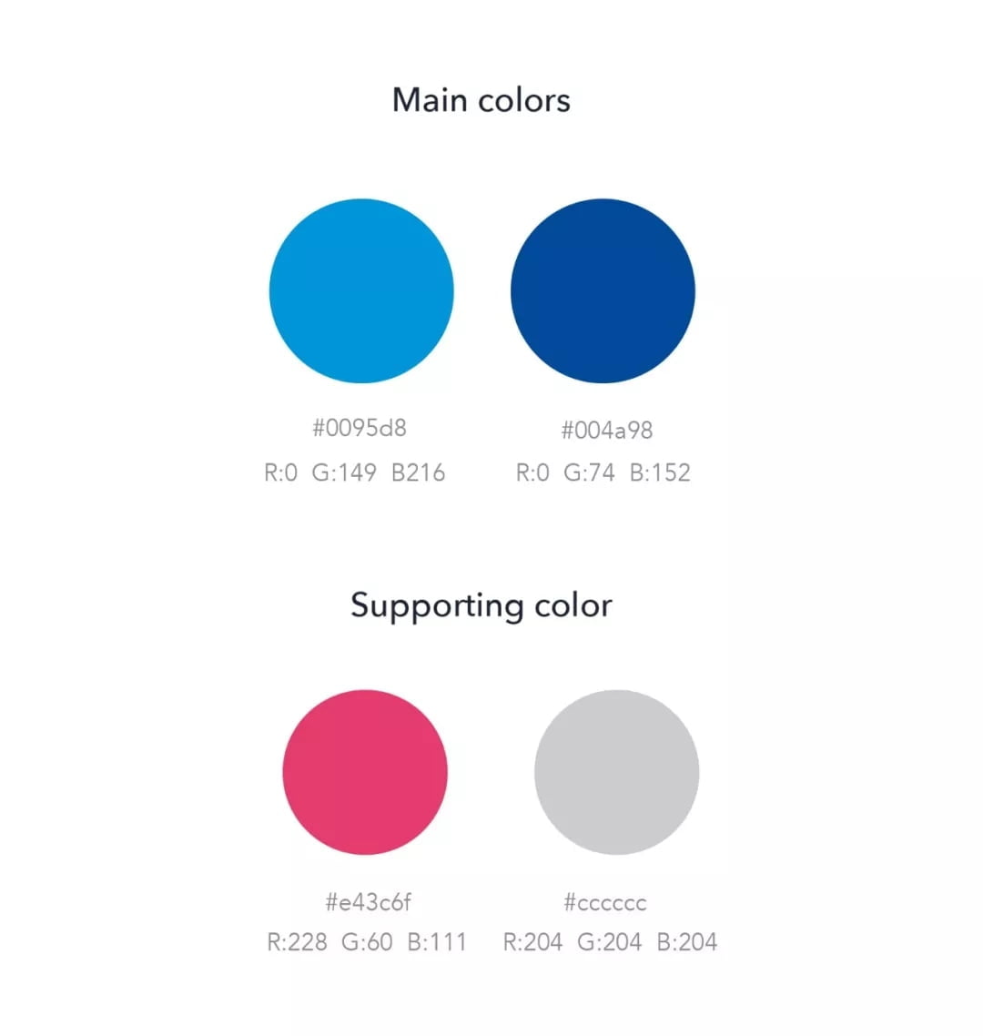
Color Palette
The analogous blue main colors create the feeling of professionalism and reliability while simultaneously bringing in the elements of nature in blue skies, water and mountains. Since blue is a cold color, we found in the tetradic color scheme, an action color which brings warmth and creates an inviting balance.
Not sure what analogous or tetradic color schemes are? We wrote about this in The Science of Choosing Web Design Colors.
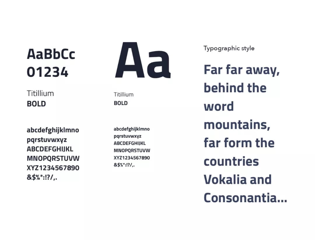
Typography
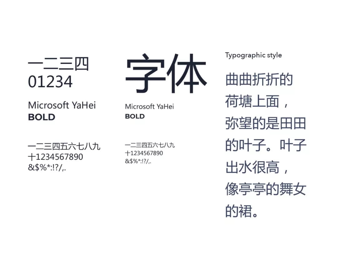
UPM’s brand guidelines name Arial as the web font, but as this is a very commonly used font, we proposed, and they accepted, that Titillium be used for a more branded look. An easy to read font, it matches the UPM logo with its rounded curves and distinct corners. Microsoft Yahei was selected as the Chinese web font for its consistency with the Latin font.
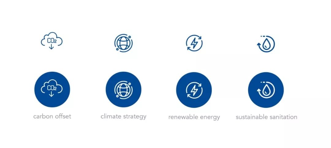
Icon style
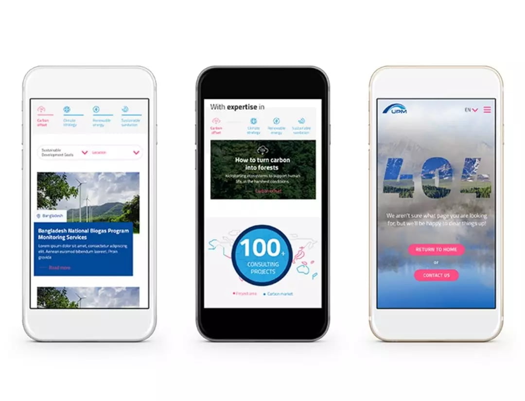
The icon style creates a fluid, holistic feeling, with the meaning that each Earth element is connected, and illustrates the continual impact that each part of the ecosystem has on the other.
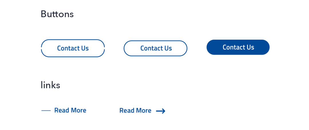
Button style
The buttons also reflect a circular ecosystem with the small cut (inactive state) representative of UPM’s role in filling in the gaps (active state). Simple text links are used to take the user to more information without distracting from the information at hand.
Collaborating with the UPM team was a pleasure. It was evident that they take great pride and care in their work, and we were very pleased to create a website that embodies this.
Wipe away the smog yourself: www.upm-cdm.eu
Scope:
- Information Architecture
- Wireframes
- UI guideline
- Responsive original web design
- Infographic animations
- WordPress-based development
- Multilingual: English, German and Simplified Chinese