
FlowBeijing
Branding is more important than ever. Colors are a key component to your brand identity, so you need to understand how colors are generated digitally or when printed to guarantee brand colors consistency on every medium.
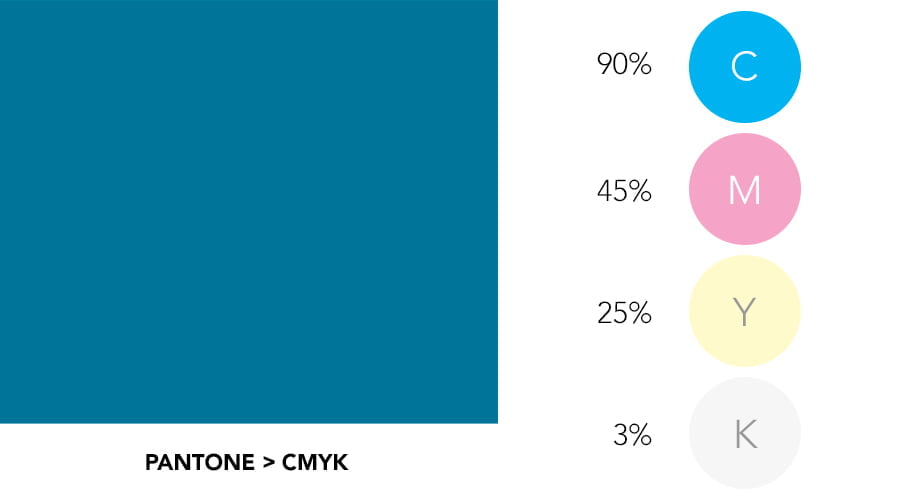
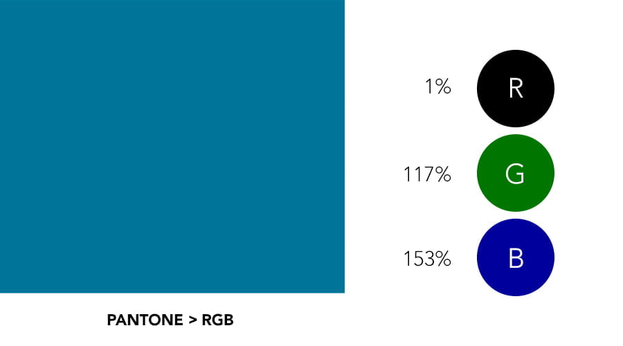
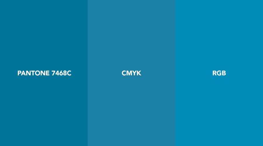
A color path to printing peace of mind
Branding is more important than ever. Colors are a key component to your brand identity, so you need to understand how colors are generated digitally or when printed to guarantee brand colors consistency on every medium.
When printed:
Pantone
I save you the details of who created it and when, what matters is why: The Pantone Matching System (or PMS) establish consistency throughout multiple printed products like paper fabric or plastics, and throughout print shops. Because the inks are premixed and controlled, the printed result is exactly the same as the Pantone colors you picked during the design process.
When to use it:
CMYK
The alternative is the CMYK process. With this system, every color of your design file is translated on the spot in a ink mix of 4 colours: Cyan, Magento, Yellow and Black. During a CMYK printing run, paper, temperature, ink levels, and printer adjustments affect the end result. That’s usually when things go wrong and you want to tear your heart out when you receive your printed material.
When to use it:
On digital screen:
RGB
This process is done by blending Red, Green and Blue lights against a computer screen, a mobile device screen, a camera screen, a television screen, any screen. Screens are not all calibrated exactly the same so there are slight differences from a screen to another.
Pantone to CMYK to RGB
Pantone and RGB can be translated to CMYK. However translation is imperfect, and sometimes just bad.
The take-away
FlowBeijing