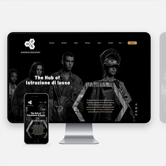
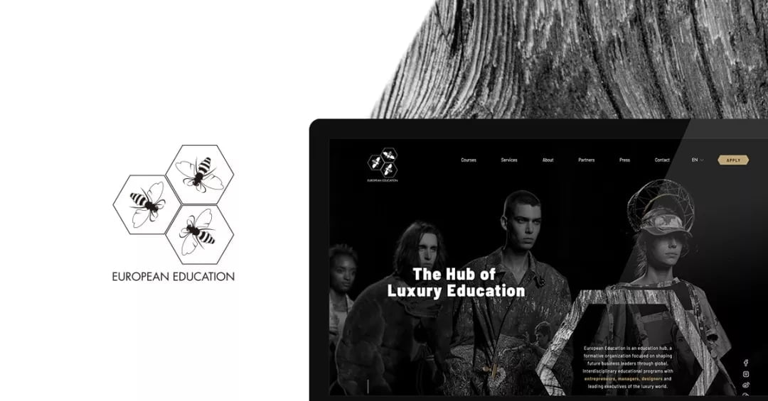
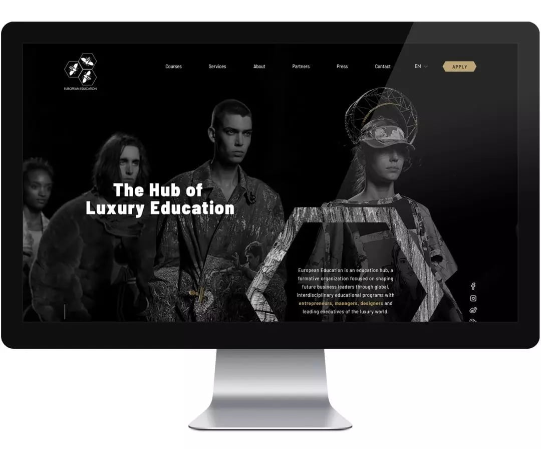
European Education, dubbed as “The Hub of Luxury Education” leads with the goal of shaping future business leaders through global, interdisciplinary educational programs presented by leading entrepreneurs, managers, designers and executives of the luxury world.
With an extensive brief, we were given a great deal of artistic freedom on “EE’s” website design.
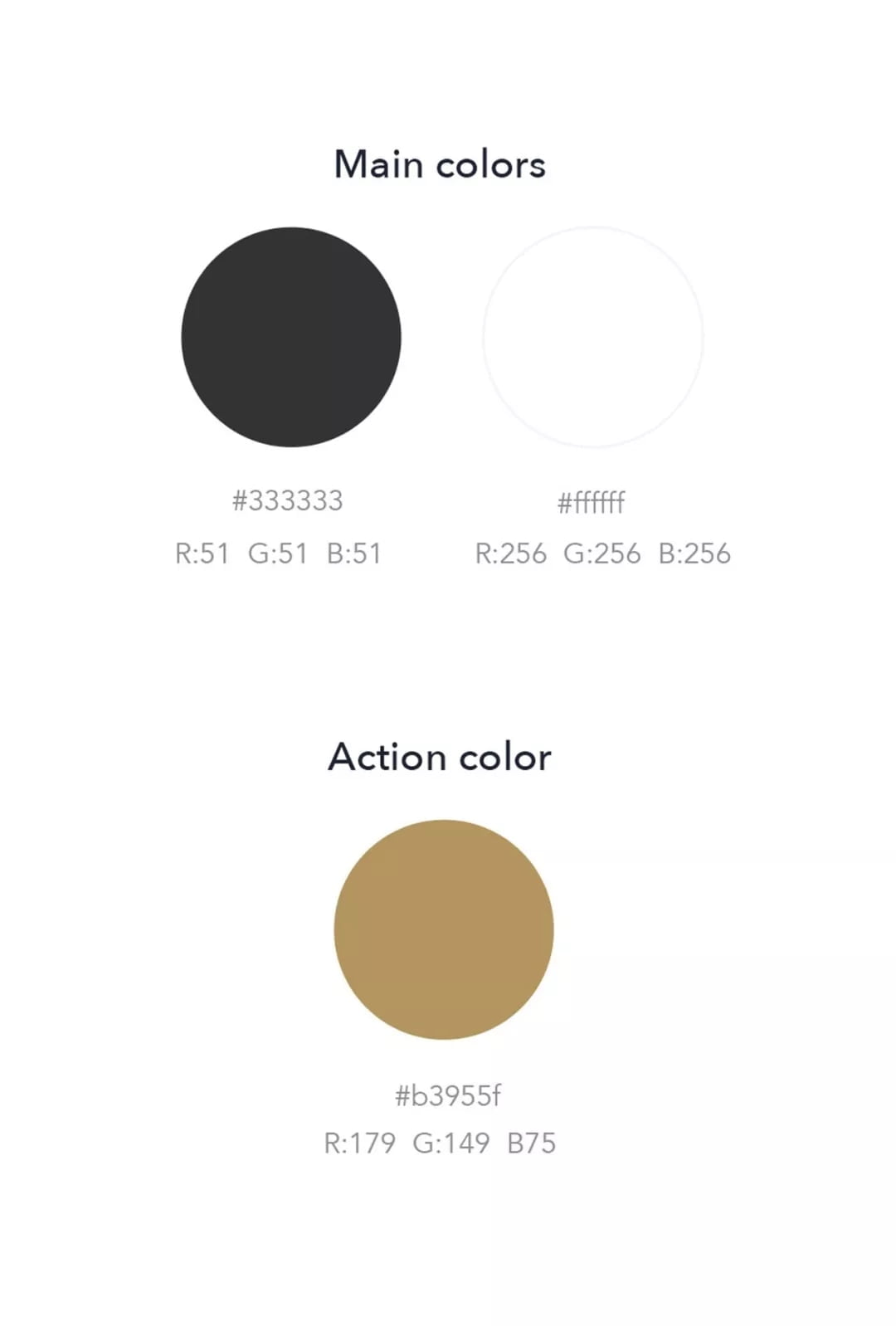
UI color palette
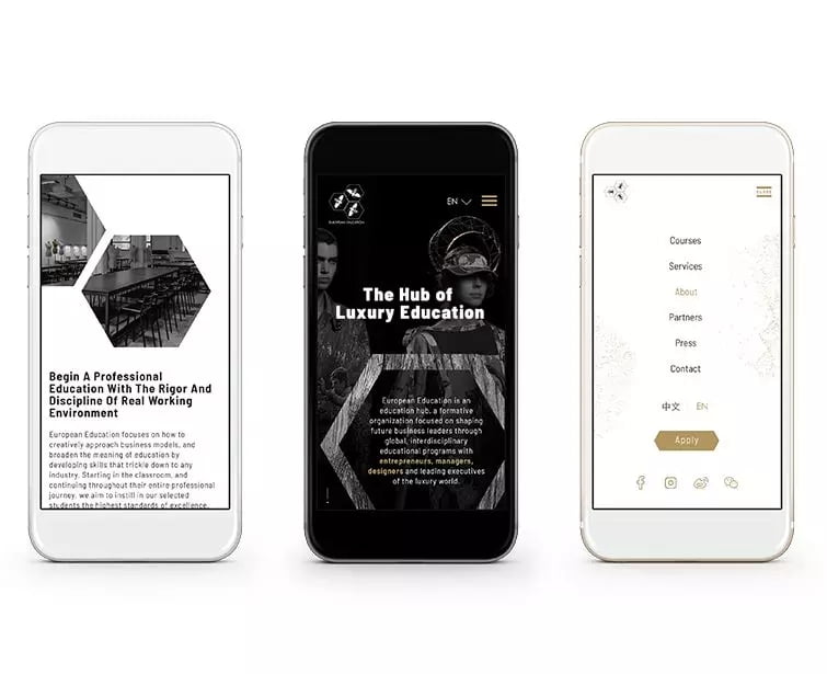
True to designer minimalism, black and white make up the entirety of EE’s color palette (logo & VI not designed by us).
To this we added the call-to-action color of gold when creating the UI design system. Gold brings a drop of luxury with ode to the logo’s bees and beehive, “hub.” It provides an important element to guide the user’s navigation through the website.
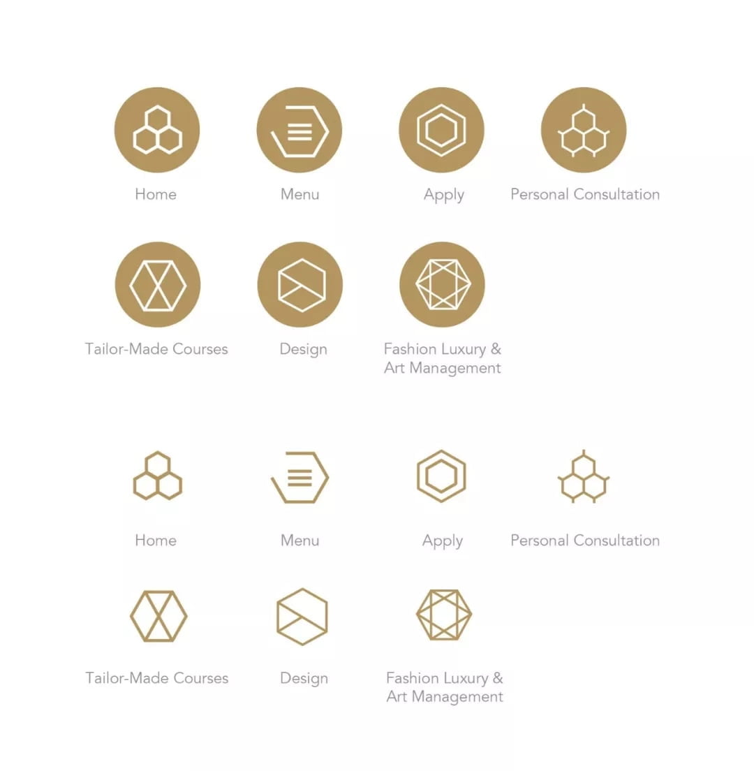
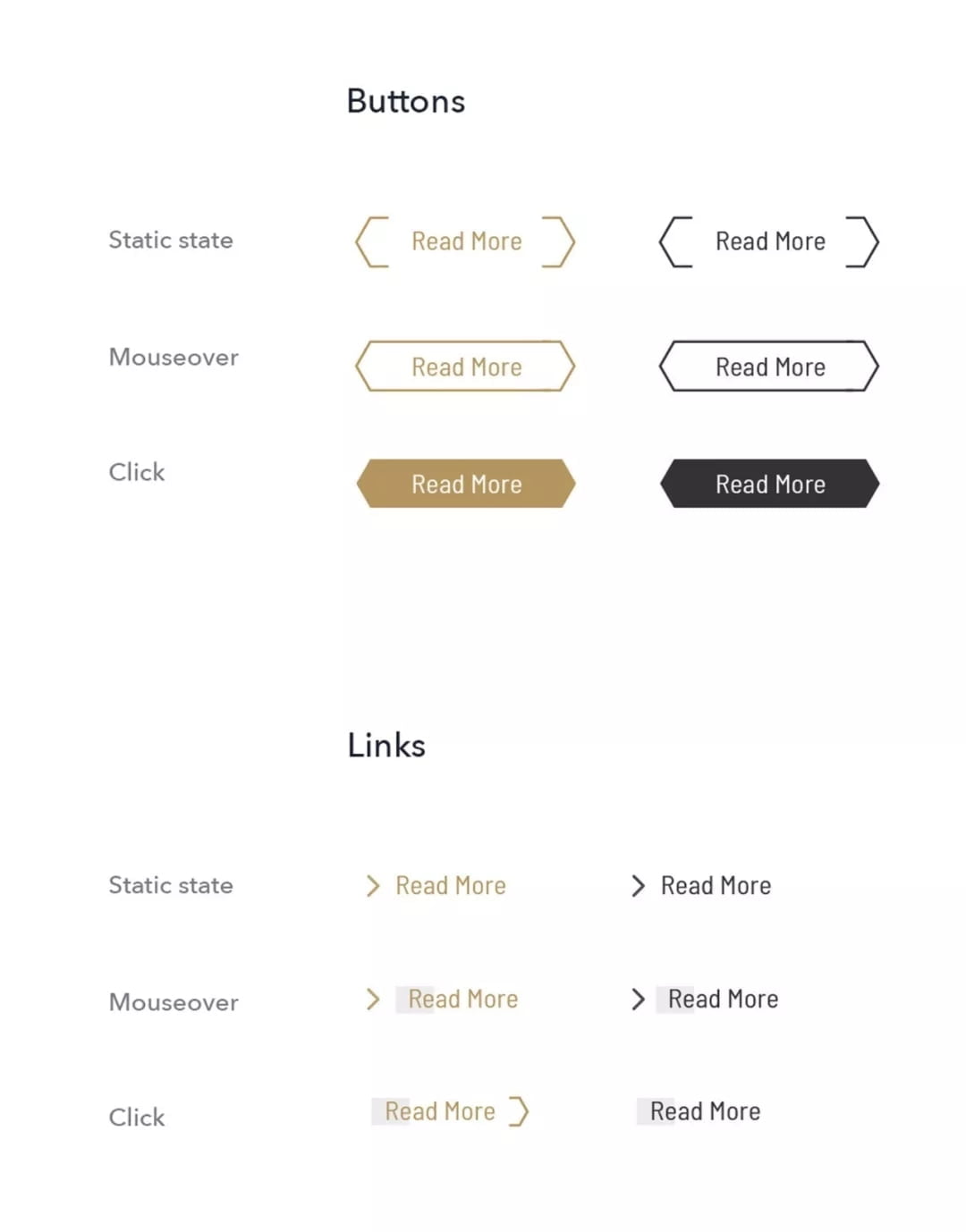
Icon set, Buttons and Interaction style
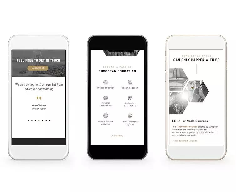
The icon set and buttons are inspired by European Education’s logo in both meaning, architecture and the hexagon recurring theme. We recognized that with a black and white palette, subtle movements have great impact. The interaction style focuses on airy drifting, balanced with swift-moving lines to create an expansive, whimsical feeling that maintains clean lines and connections.
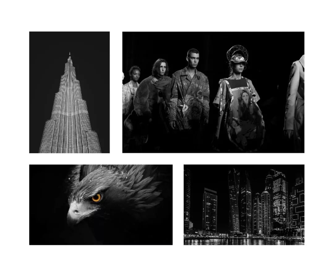
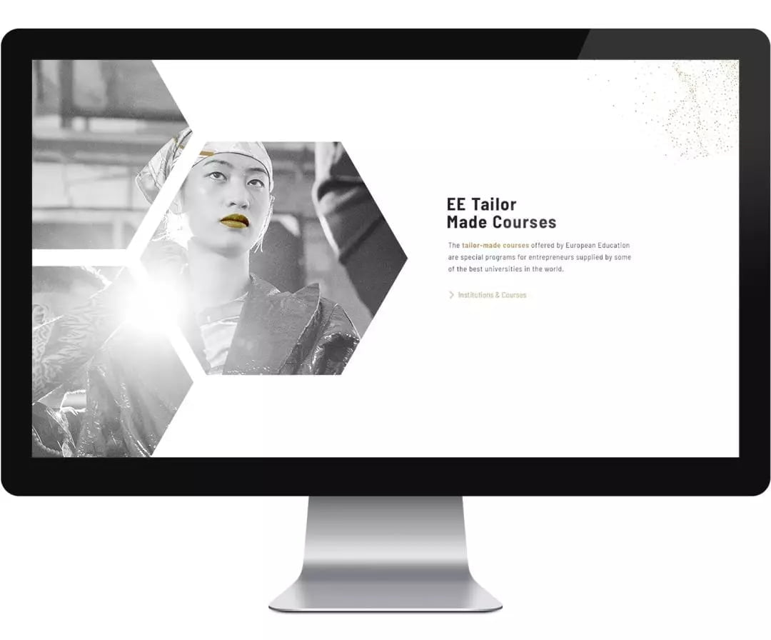
Visuals style
Visuals are utilized to present locations and course experiences. Secondary visuals present abstract elements of the fashion industry- wood, fabric, water and nature, and bring texture and harmony to the high fashion primary images.
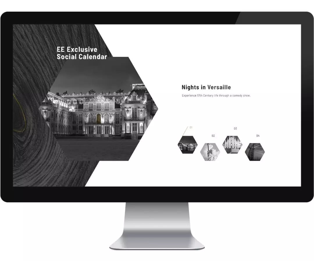
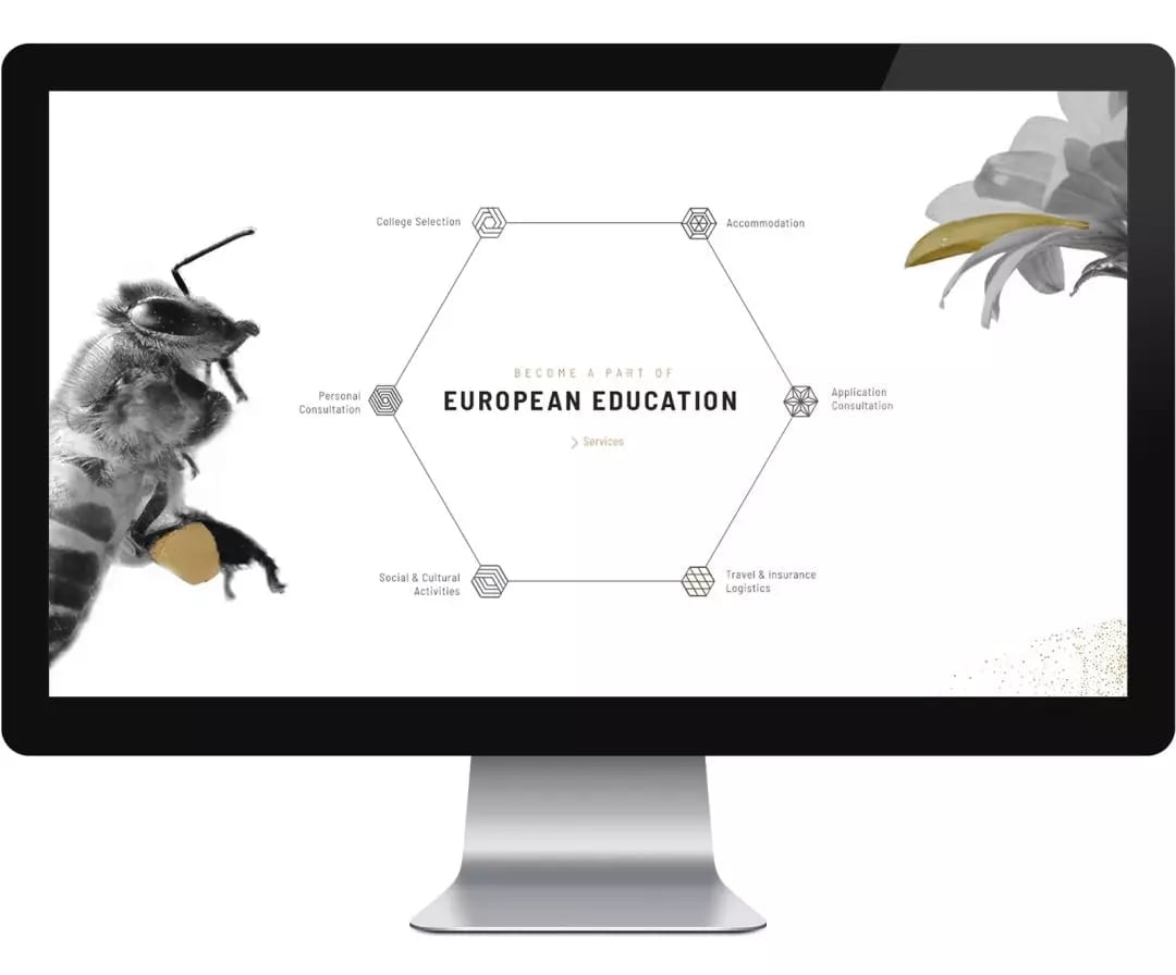
The use of hexagons
We leaned heavily on the honeycomb-esque hexagon shape derived from EE’s logo. By using different sizes and layerings of hexagon-shaped images, we were able to break typical layout grids and simultaneously give an experiential feeling of peeking into a design studio, classroom, runway or city.
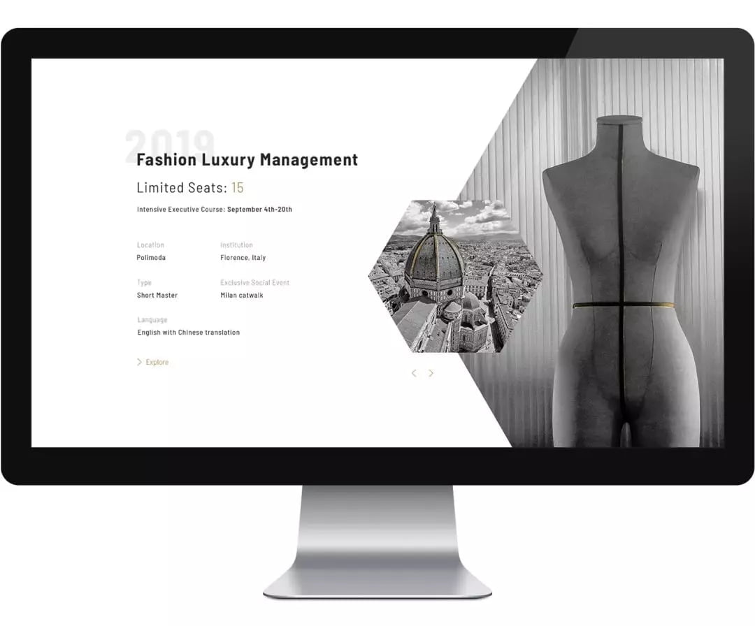
The balance of consistency and surprise
European Education really wanted to keep text to a minimum and create an atmosphere instead. We utilized mixed content treatments to embrace the unexpected yet still ensure ease of navigation and information digestion.
We really enjoyed working with the creative minds of EE and appreciated this opportunity to build something fresh. Experience it yourself at european-edu.com
“When you want to make the difference in professional life and in the market you need the right partners to really achieve improvements and bring fresh ideas. Flow is a partner company able to provide added value through distinctive and precious contents. We gave them the basic elements and they made it happen. They were able to understand our vision and interpret our company spirit and tastes. They brought the needed results to properly impact in the digital environment”.
Andrea Claudio Galluzzo
Director | European Education
Scope:
- Wireframes
- UI guideline
- Responsive original web design
- Made-for-China technical specifications
- WordPress-based development
- Multilingual: English and Simplified Chinese
- ICP Application support