Setting Up Camp

1 min read October 11, 2017

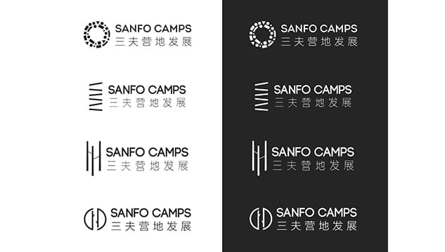
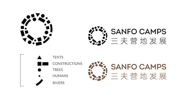
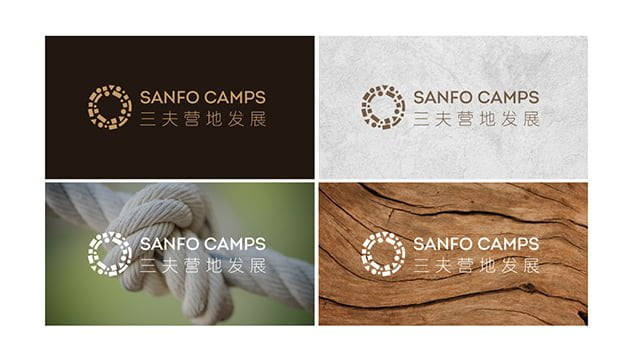
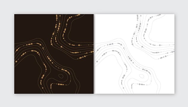
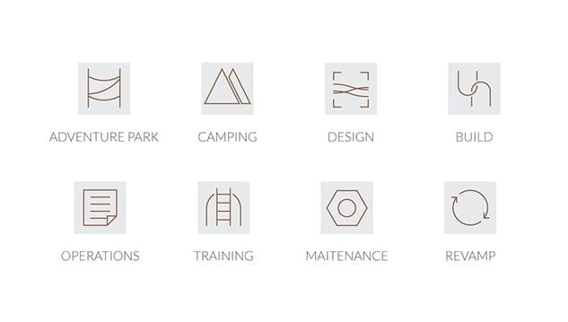
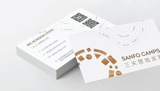
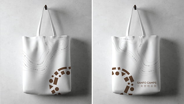
Any great adventure includes multiple layers of discovery. When SANFO CAMPS, a full-service camp and adventure park development company, came to us to design their logo and visual identity, we were excited to embark on the creation of a visual representation for their self-described personality of β€œfun, adventurous, excellent, and compassionate.”

,

Logo

The design concepts were inspired by the harmony of nature, construction and SANFO CAMPS’ genuine care for people experience.

,

After multiple concepts were presented, SANFO CAMPS! Inspired by the shapes of the combined elements of an adventure park seen from above, and the rings of a tree trunk, the logo is unified in a circular shape, maintaining the simplistic elegance required in design and engineering.

,

Color Palette & Textures

The color palette is inspired by the ground and nature for which the adventure camps are built and the material used in their construction. They allow for versatility in application across web, park placards and marketing materials.

,

Pattern

We created a pattern inspired by the topography of a landscape design project. Continuity with the logo can be seen through the integration of the small logo elements and the fluidity of woodgrain and water.

,

Icons

Our brand designer created the icon set from scratch, further exemplifying simplicity and movement.

,

Logo & VI Applications

,

We have enjoyed this journey with the Sanfo Camps team and we are looking forward to continuing in their mantra of β€œDesign, Build, Training, and Operation” as we design and develop their website.

Related articles

Website Design Trends in China for 2024

Website Design Trends in China for 2024

3 min read
From Global to Local: Content Localization in China

From Global to Local: Content Localization in China

3 min read
Let’s Talk.

Ready to expand into the
China digital ecosystem?

This field is for validation purposes and should be left unchanged.