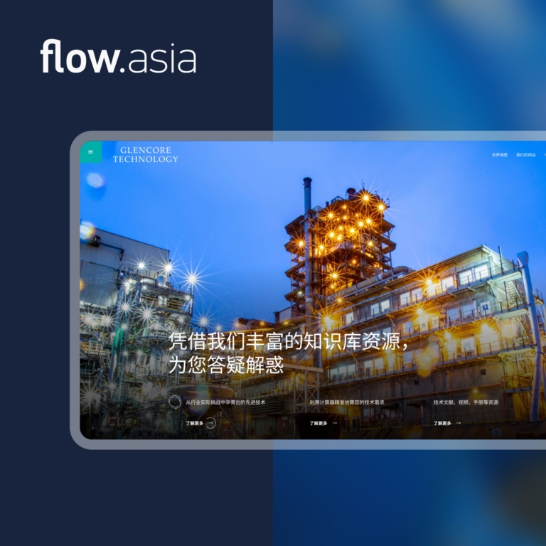
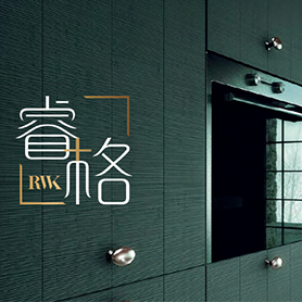
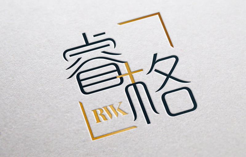
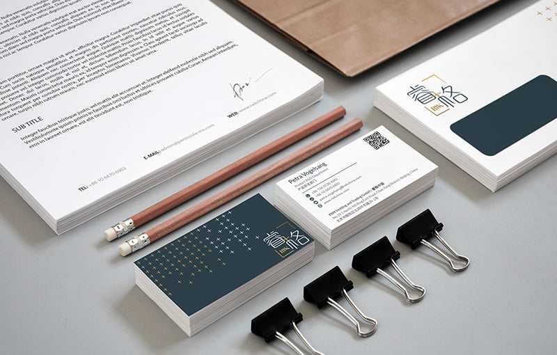

In 1923, brothers, Robert and Wilhelm Kuhlmann established the RWK high-end custom cabinet brand in Bielefeld, Germany. With nearly one hundred years of experience, the RWK brand entered the Chinese market in 2014 with the name 睿格 “Ruige.” Seeing continuous growth, they felt the urgency for brand localization and the establishment of a made for China sub-brand visual identity.
Logo Design
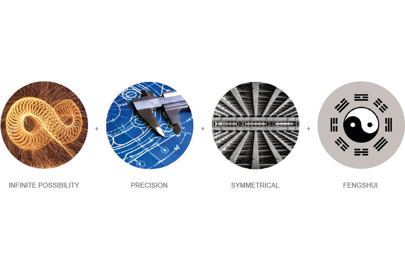
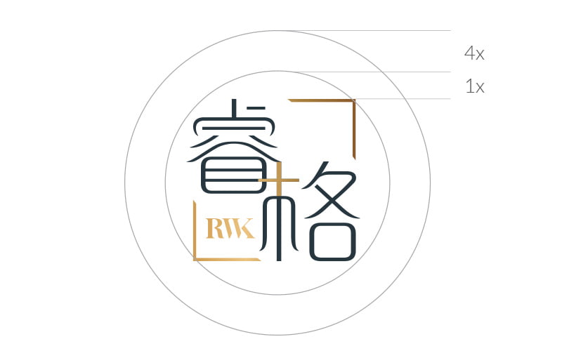
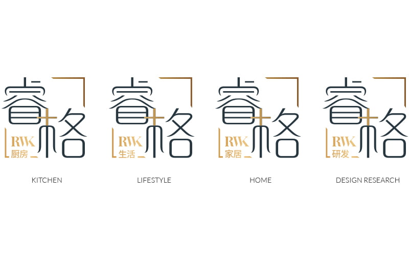
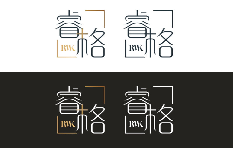
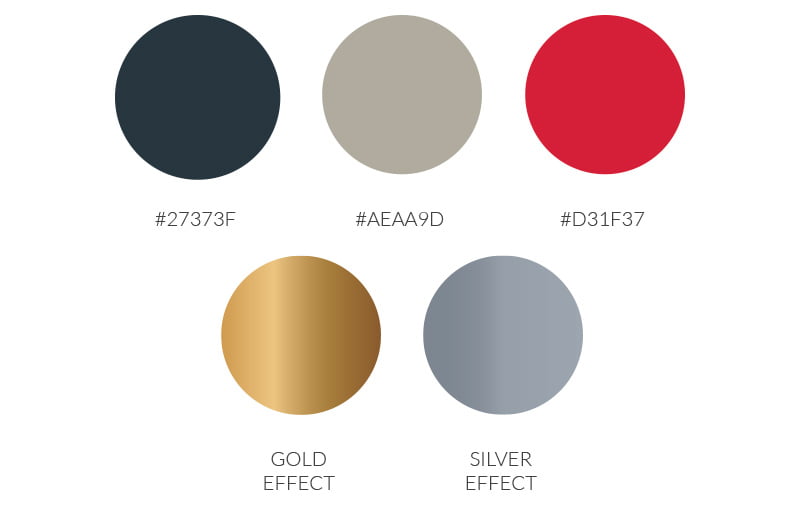
“Exquisite German craftsmanship, integrated with Chinese design elements. Listen first and then plan. Focus on the details of quality. Differentiate from others. Empower the business to expand in many directions.” These are the goals that Ruige came to us with, along with the overarching challenge of creating Ruige’s visual brand appeal to the targeted Chinese consumer. In the creation process, we created a unique brand vision using the driving concepts of “Original Chinese Fonts,” “Connection to the RWK bloodline,” “Infinite Possibilities,” “Symmetry,” “Precision,” and “Chinese Feng Shui” for guidance.