We haven’t published much lately as we were busy creating logos and visual identities for a blockchain project, one VR company, a 55 year running Chinese language program and one non-profit.

We haven’t published much lately as we were busy creating logos and visual identities for a blockchain project, one VR company, a 55 year running Chinese language program and one non-profit.
,
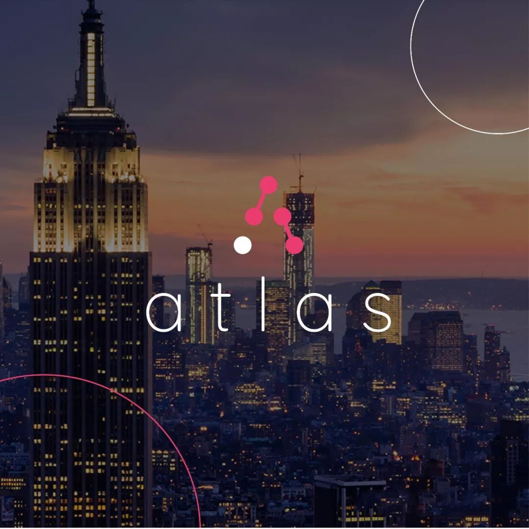
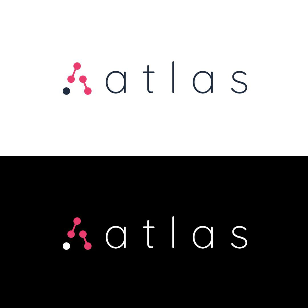
Atlas
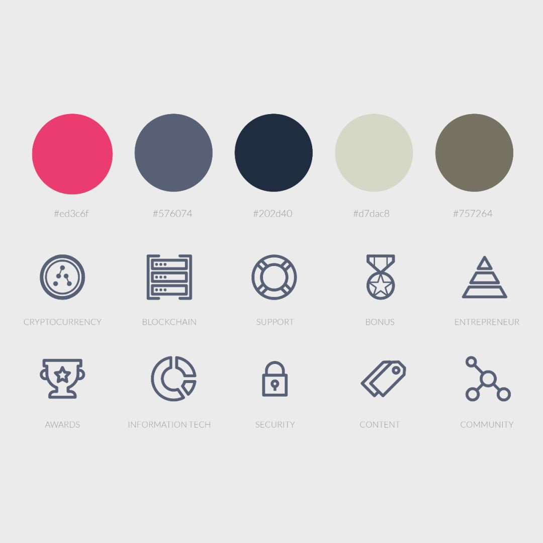
Atlas is a universal blockchain platform for the travel industry, providing a robust smart contract based travel ecosystem environment that incentivises content creation, data sharing and ensures cooperative yet trust-free relationships between service providers across the entire travel value chain.
,
Flow Solutions & Outcomes
Flow created a modern logo inspired by the name and the platform’s mission. The logomark takes the first letter of the name, A, and creates it in the shape of an arrow to symbolize growth with the duality of the universal location/GPS symbol-showing movement and travel. The components forming the A are created in a visual reference to connectivity.
Scope:
,
,
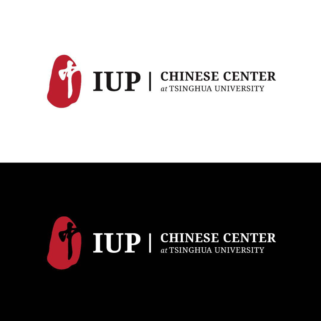
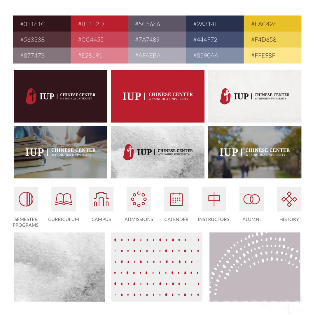
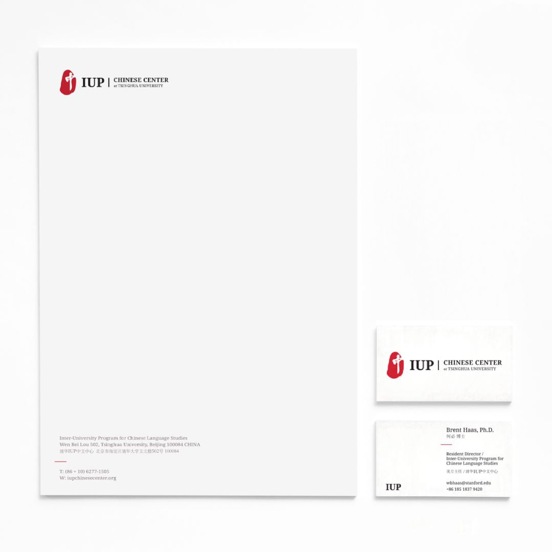
The Inter-University Program for Chinese Language Studies (IUP)
IUP is the premier Chinese language program sponsored by twelve elite North American universities with the mission of raising their students’ Chinese language proficiency to a level at which they can function independently in professional or academic careers. Founded in 1963, Stanford University currently serves as IUP’s coordinator.
,
Flow Solutions & Outcomes
Through user research and interviews, we understood the importance of embracing the historical and the future. The history of the program, of China and Tsinghua University (IUP’s current location) were embodied with the colors- think Summer Palace architecture and textures- think ink and paper. IUP’s constant evolving growth and impact on its students’ futures is portrayed in the modern patterns, icons and color application.
Scope:
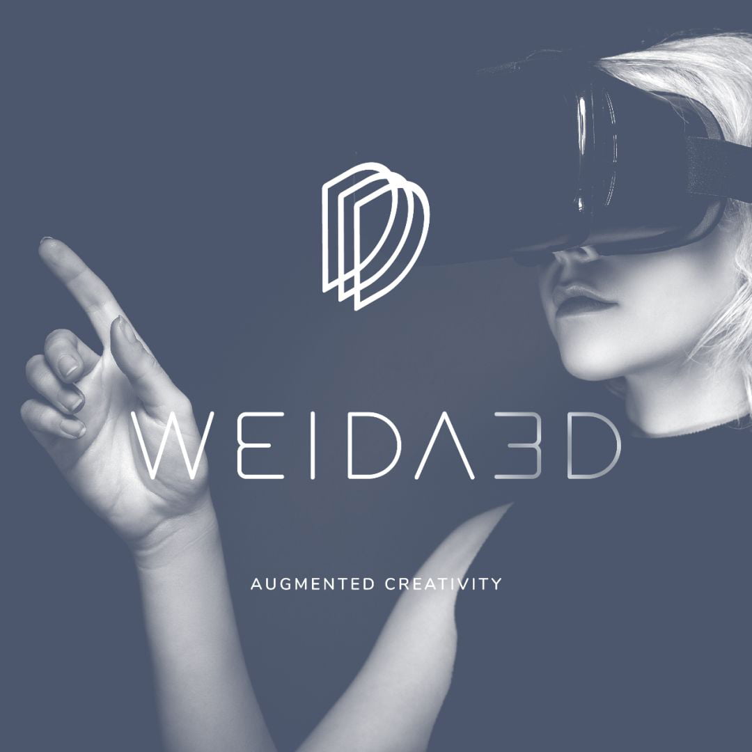
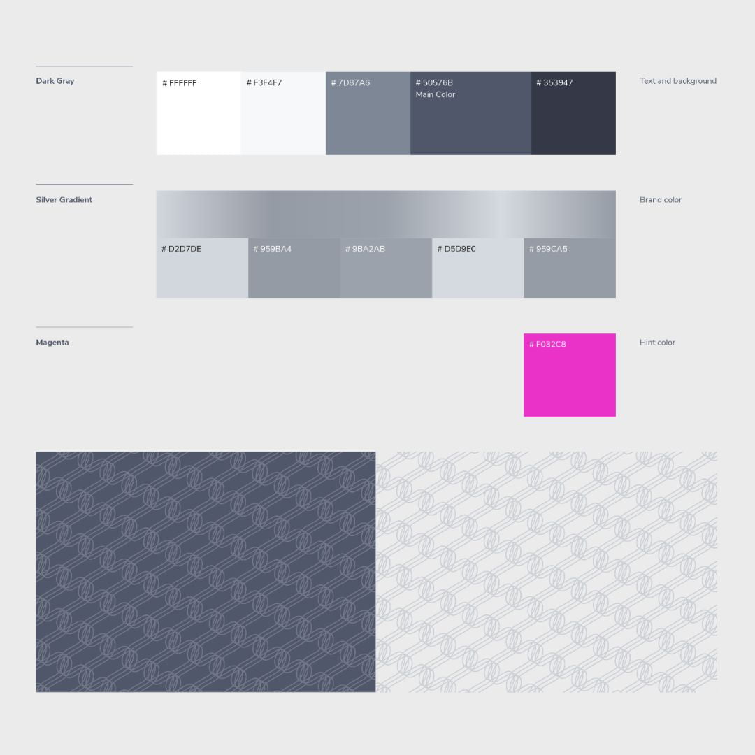
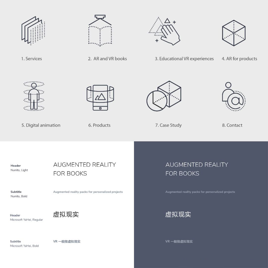
Weida 3D
Weida 3D is a technology company engaged in virtual reality (VR), augmented reality (AR) and digital animation, creating another dimension of interaction for books, products, educators and architects.
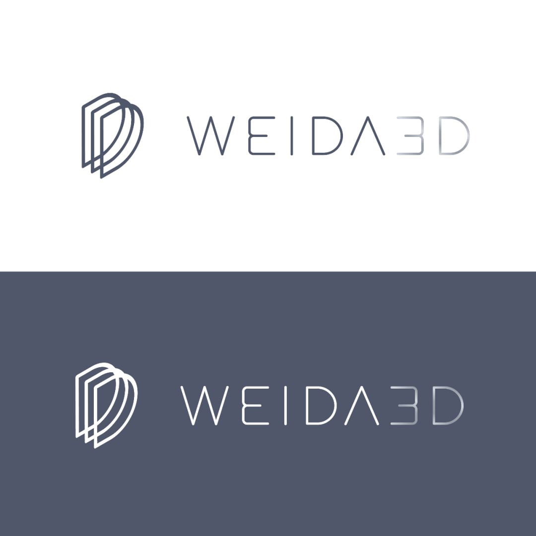
Flow Solutions & Outcomes
Flow worked to visually represent Weida 3D, embodying their key brand words of: Simplicity, elegance, modernity and storytelling. The logomark not only represents 3D, but also their proven work flow of Design, Develop and Deploy. The icons were first hand drawn by our brand designer.
Scope:
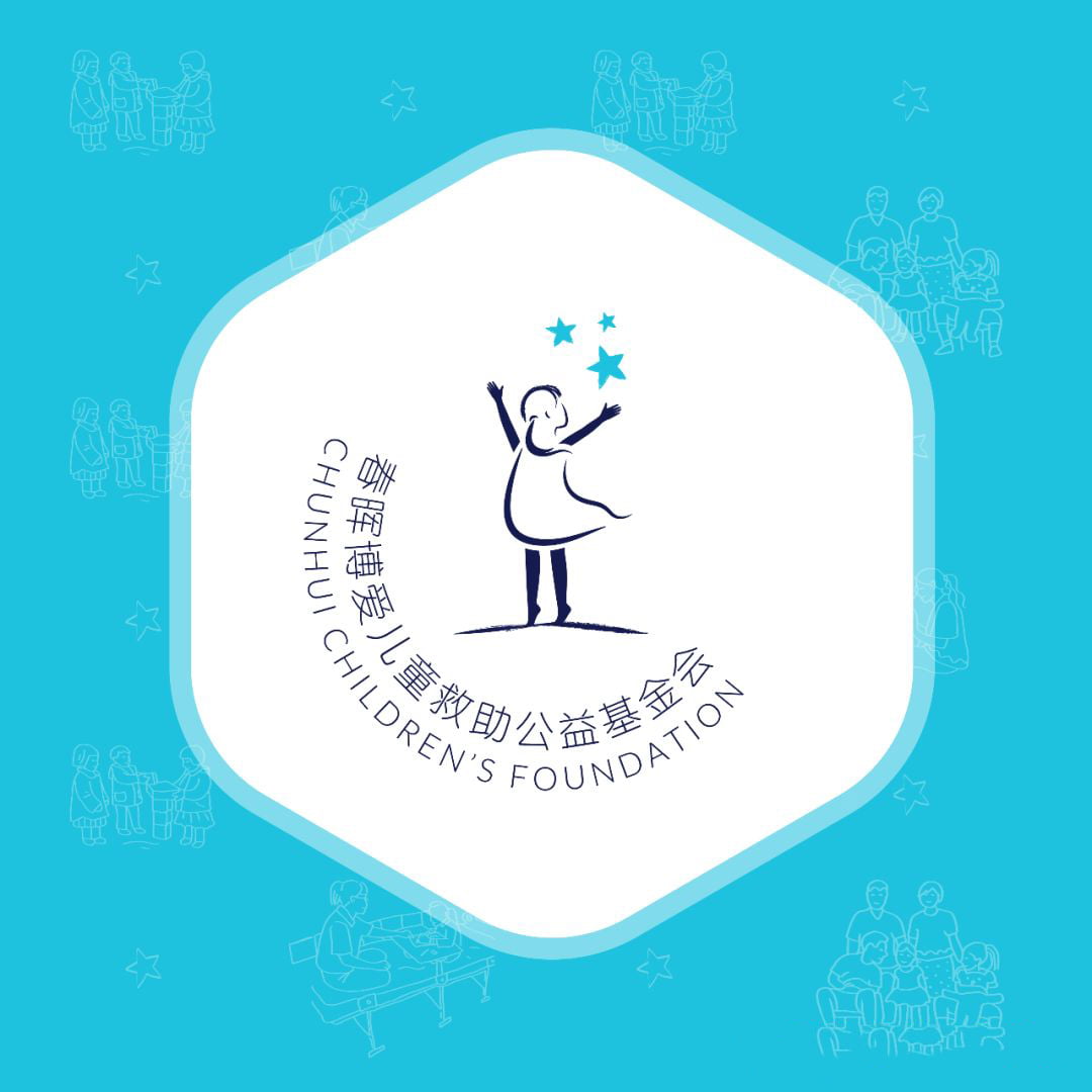
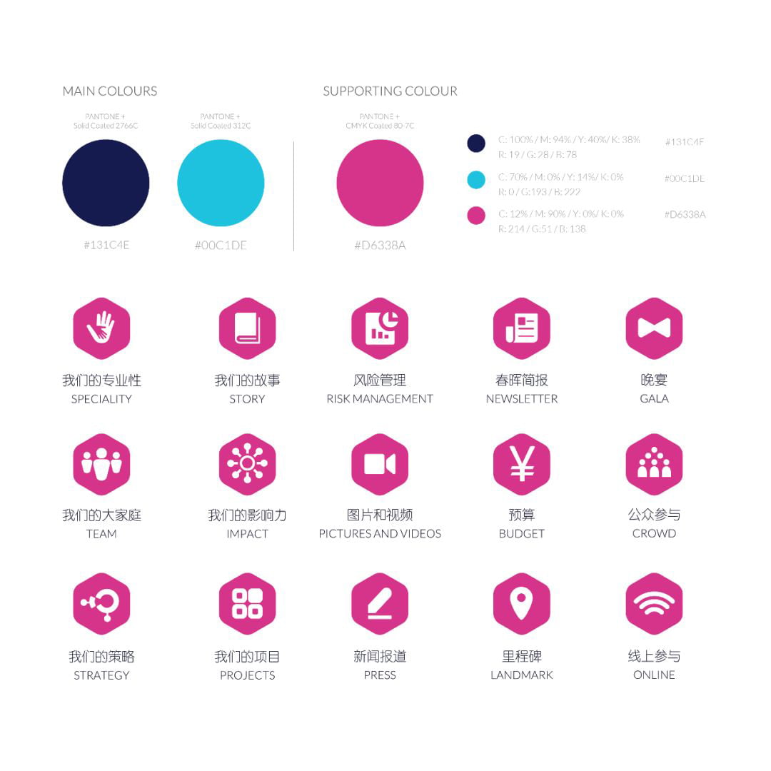
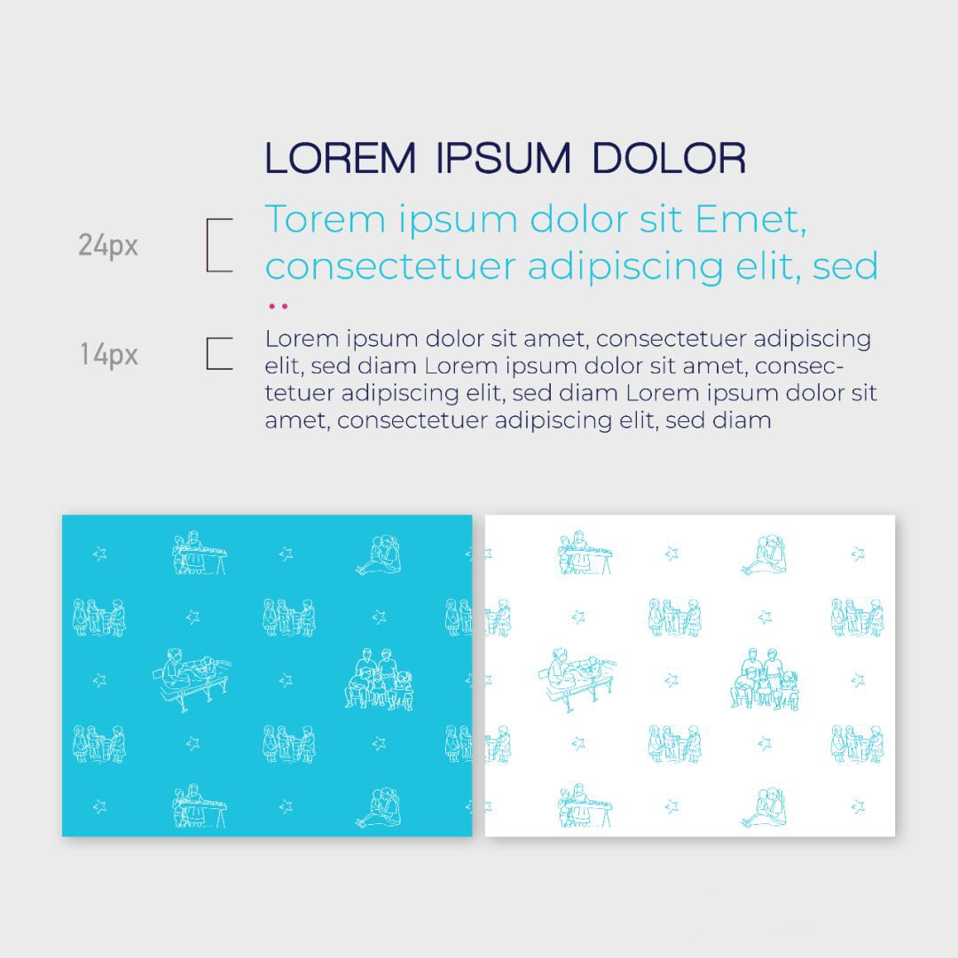
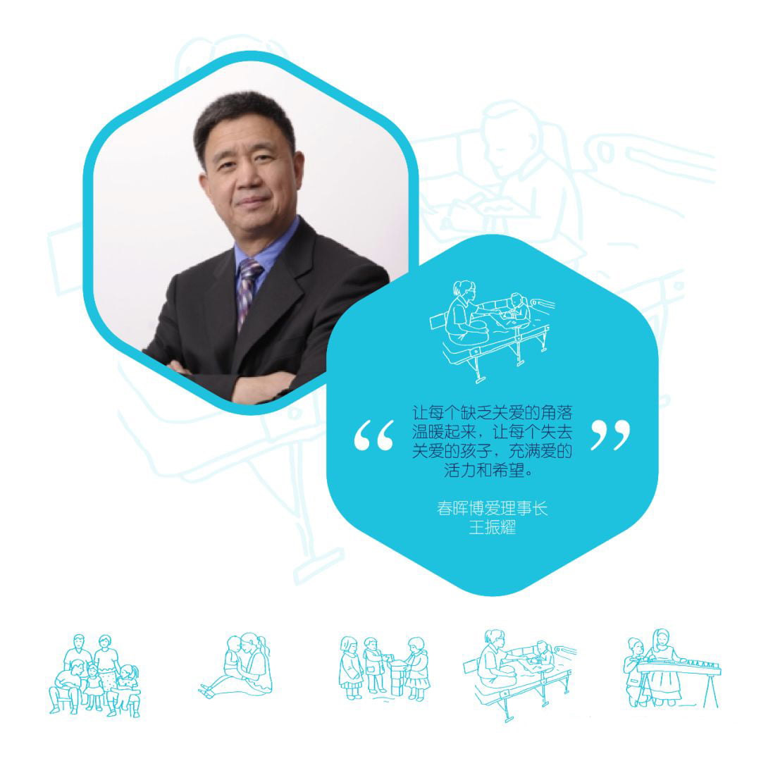
Chunhui
Chunhui Children aims to provide responsive care for children who, for whatever reason, have lost what should be every child’s birthright – someone who cares. They operate and support nurturing and education programs with a proven track record for enabling at-risk children to reach their full potential.
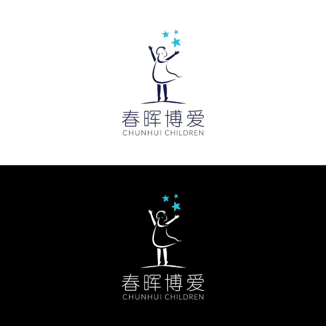
Flow Solutions & Outcomes
Flow worked to fulfill Chunhui’s goal to create a contemporary and aesthetically pleasing design while, keeping in mind their key messaging and donor demographics.
Scope:
Now that you are up-to-date on our latest branding work, stay tuned for our latest digital adventures- we are excited to announce that we will be working with the British Council in Beijing to create an alumni social platform and look forward to taking you along on the journey!