ARKA Visual Identity

1 min read November 15, 2017

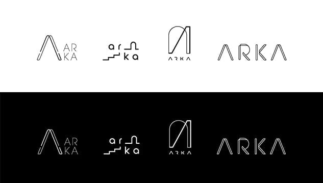
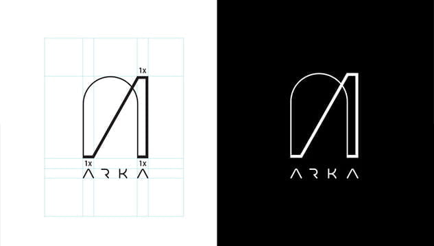
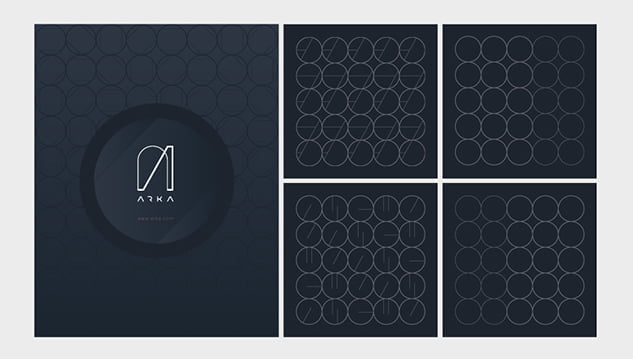
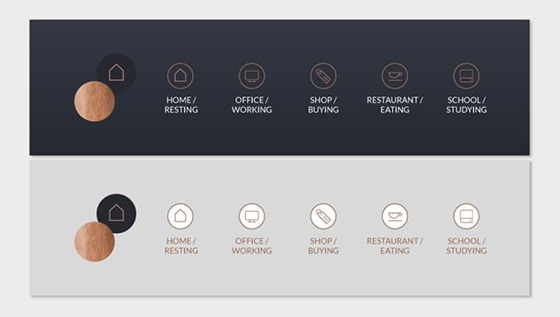
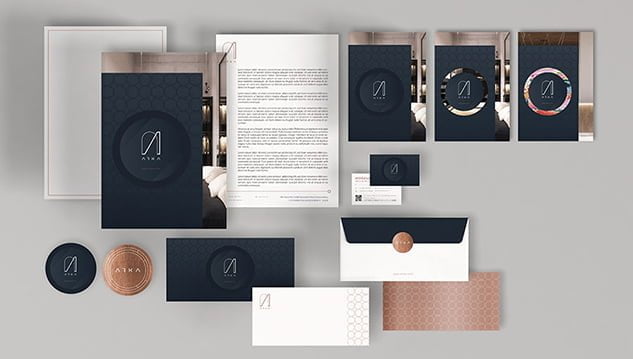
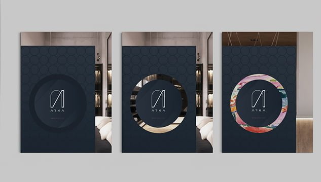
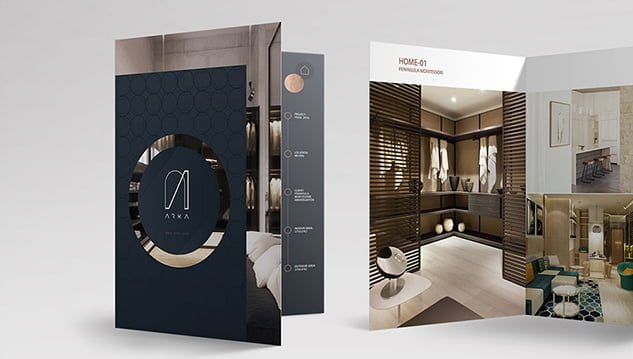
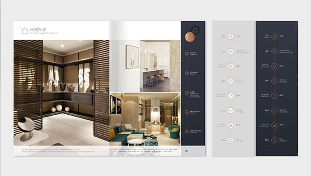
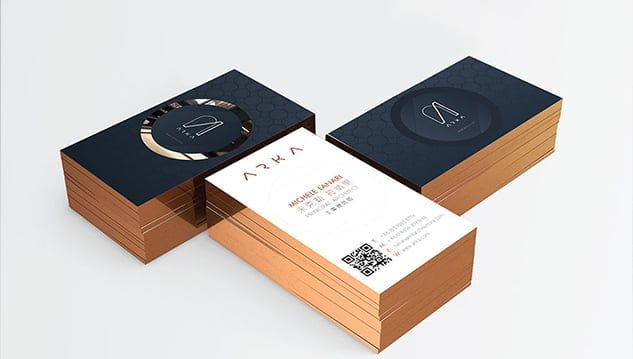
Elegant, playful, classic and free, exemplifies the visual identity we set out to design for ARKA residential branch, an architecture and interior design studio based in Beijing. A studio that designs for a wide range of clientele, we worked to develop the brand aesthetics with sophisticated yet adaptable effects.

,

Logo

When creating the logo we took inspiration from the semantic meaning of ARKA’s name- that they shared with us in the design brief.

ARC

  • a line or shape that is curved like part of a circle
  • the apparent path described above and below the horizon by a celestial body (as the sun)

ARCH

  • a usually curved part of a structure that is over an opening and that supports a wall or other weight above the opening

ARK

  • a boat or ship held to resemble that in which Noah and his family were preserved from the Flood
  • something that affords protection and safety

BARCA – Italian small boat

,

Visual Identity

ARKA’s designs are inspired by the Vienna Art Deco movement and by the curves and shapes of yacht design, a representation of modernism and luxury. We incorporated this signature into each aspect of the visual identity. The pattern combines line art & shapes, integrating the idea of dual project direction -signature design and made to measure- and the subtleties of the movement between less and more.

We worked to create a brand visual identity as versatile as ARKA itself. For example, in the folder design below, the background image inside the circle can be changed according to the project of their client.

,

,

,

Related articles

Website Design Trends in China for 2024

Website Design Trends in China for 2024

3 min read
From Global to Local: Content Localization in China

From Global to Local: Content Localization in China

3 min read
Let’s Talk.

Ready to expand into the
China digital ecosystem?

This field is for validation purposes and should be left unchanged.